
The world would feel a lot different without branding. Storefronts would appear monotone and muted, like buildings on a military base. The inside of clothing stores would have shelves of shirts, drab and plain like sheets of paper. And let’s not begin to think about what the inside of a bike shop would look like without a recognizable color or image on the packaging of a tire, or set of grips.
Shoppers would base their decisions off the shape of the frame and ride quality alone without advertising influence or asking if the mountain bike brand matches up with their own identity. Ok, in some cases, that might be a good thing.
But, for most of the mountain bike industry — and possibly mountain bike culture itself — things would fall apart. Branding plays a huge role in how companies compete with each other and create markets for themselves.
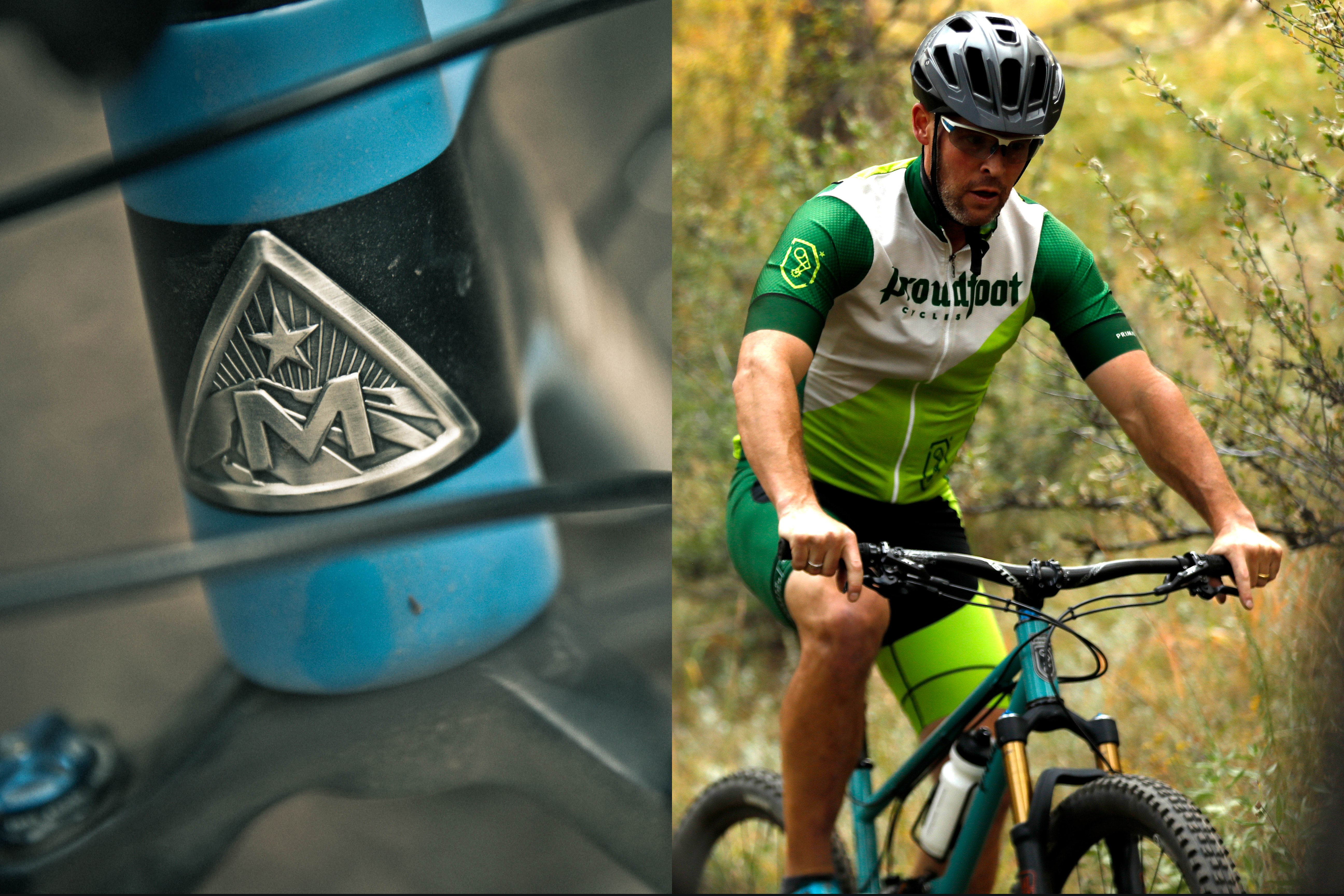
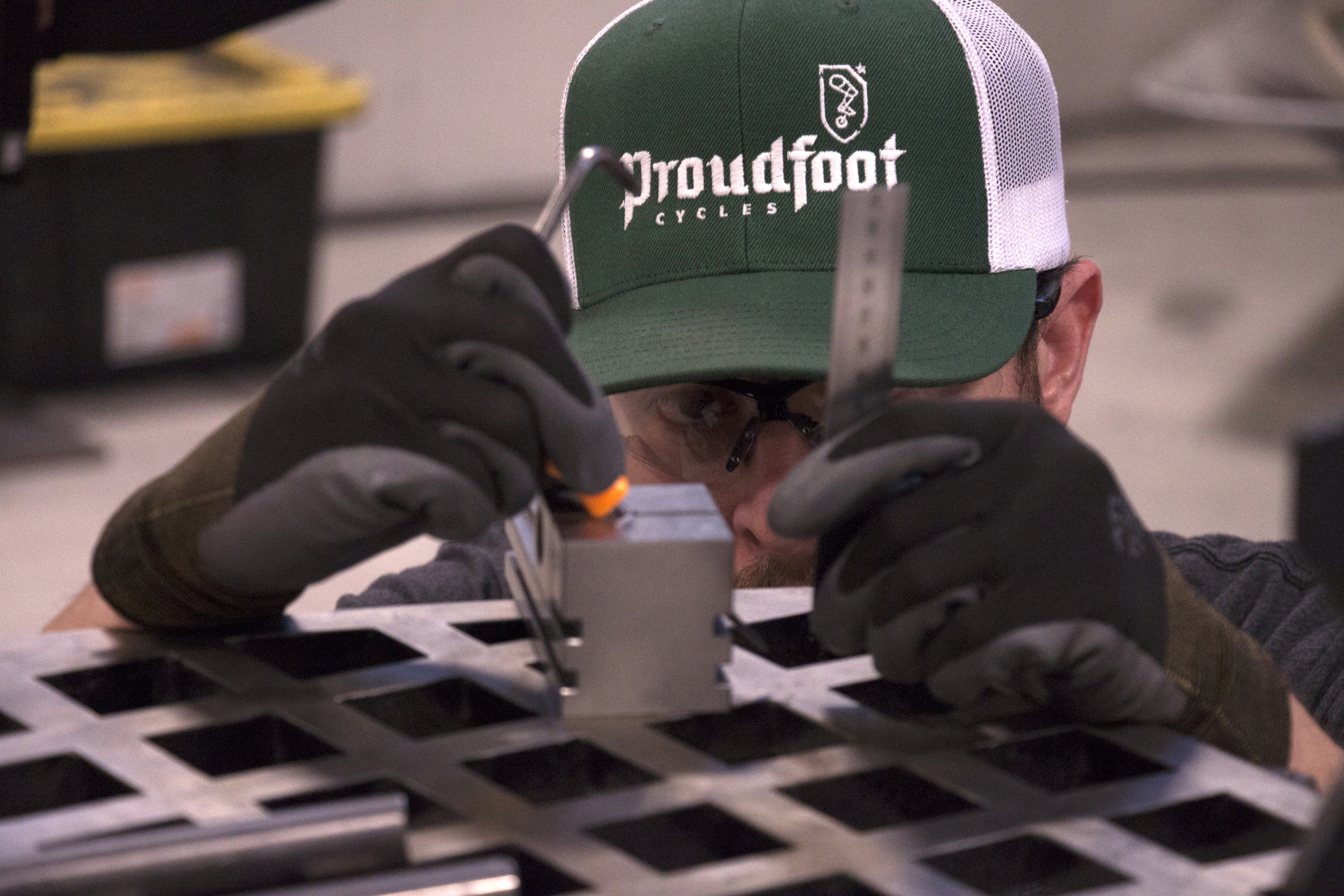
Proudfoot Cycles
When Jon Acuff of Proudfoot Cycles started building bikes, the build quality was the most important thing for him, but he quickly realized he needed to portray that to consumers in one way or another.
“As an engineer, I didn’t even think of this stuff. My perspective is that, if you make it really good, it’ll just sell,” says Acuff.

Acuff and his wife co-founded Proudfoot and sourced a third-party marketing firm to help them create their brand.
A few things came into play. Acuff’s grandfather’s middle name was Proudfoot. The family has a Scottish heritage and a deep history in engineering. His lineage traces directly to the Wright brothers and his family now specializes in manufacturing pressure switches for airplanes.
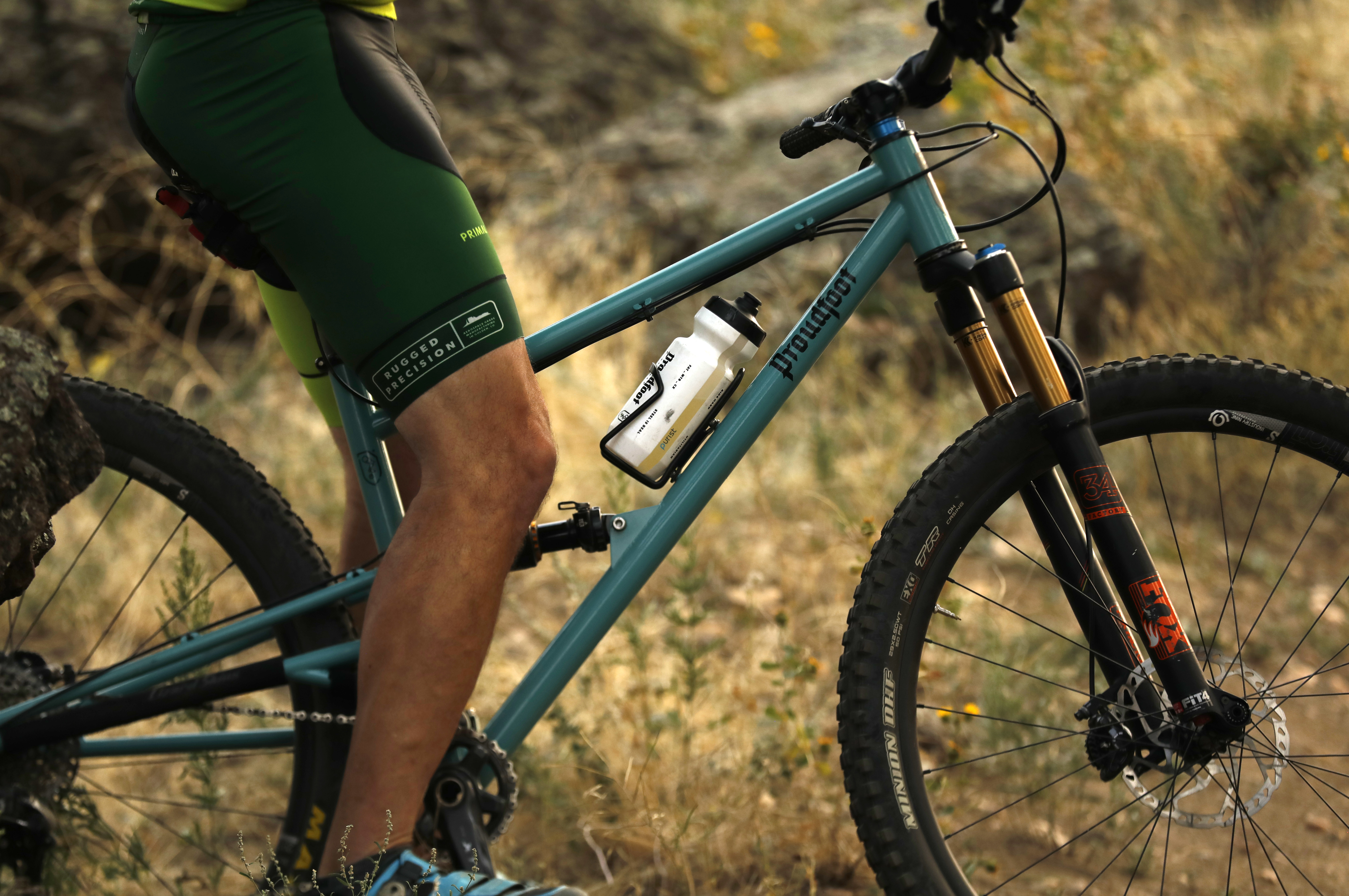
Their Scottish family crest featuring a leg was turned into a bike logo by placing a crankset and pedal underneath the foot. The typography and font for Proudfoot was also inspired by their Scottish heritage, while the engineering history played a role in other design elements on the bike like a manufacturing plate on the downtube with the slogan, ‘rugged precision.’
The slogan is meant to imply that the bikes are made with a high quality that will last, whereas many other hand-built bike brands tend to hang their hats on the side of artistic creativity.
“When you’re trying to find out who your brand is, it’s almost a personal search in what the business is going to be,” Acuff said. “I wanted to build bikes. It was pretty simple to me.”
Sean O’Brien led the design and branding for Proudfoot Cycles. He had Acuff write a stream of consciousness about why he wanted to build bikes, what he thought he’d bring to the industry, and what he wanted the brand to be about.
“Before you even put pen to paper, you’re trying to figure out who you are, what you mean, and how you want to position yourself out in the world. That’s where all the family history, and personal history, and all the details about Jon as a builder come in,” says O’ Brien.
O’Brien recognized that Acuff’s engineering history and Scottish heritage would make up the major elements of their branding.
“Being able to transfer all those details into the identity is what made it special to them. Something to where they could get up in the morning and put that shirt or hat on and feel like it was a part of them and something that they could grow into.”
O’Brien worked the branding from a logo, to a slogan, into their photography, and even down to the paint schemes of the bikes themselves. Proudfoot is happy to do custom paint jobs, but their mainstay colors are inspired by Colorado landscapes. Their purple frame color is actually called Penstemon, and based off the wildflower that grows in Colorado.

O’Brien handled most of the Proudfoot branding on his own, but says that if a major brand like Trek or Giant sought help, the work would be divided amongst a team over certain specialties. However, these companies often handle their branding internally.
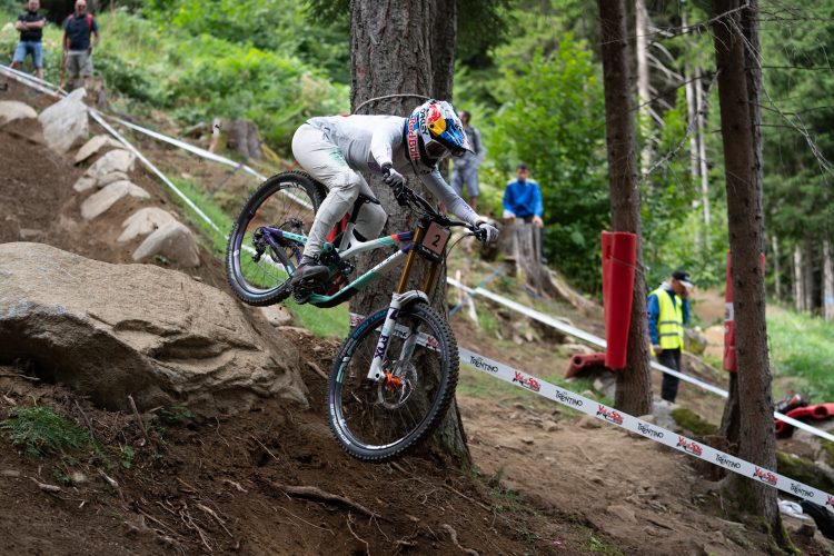
Singletracks requested an interview with Specialized to talk about their branding as one of the top bike companies in the world. The red S is iconic and as recognizable as the blue Ford oval, and the brand is sometimes painted by the public as sue-happy in comment threads across the internet.
After initially agreeing, Specialized did not respond to multiple phone calls and emails from Singletracks for the interview.
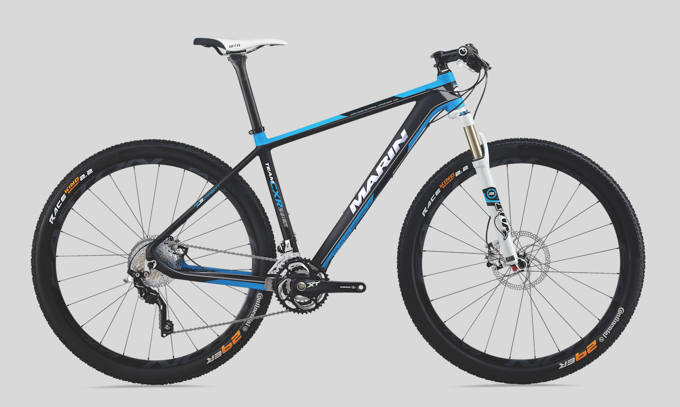
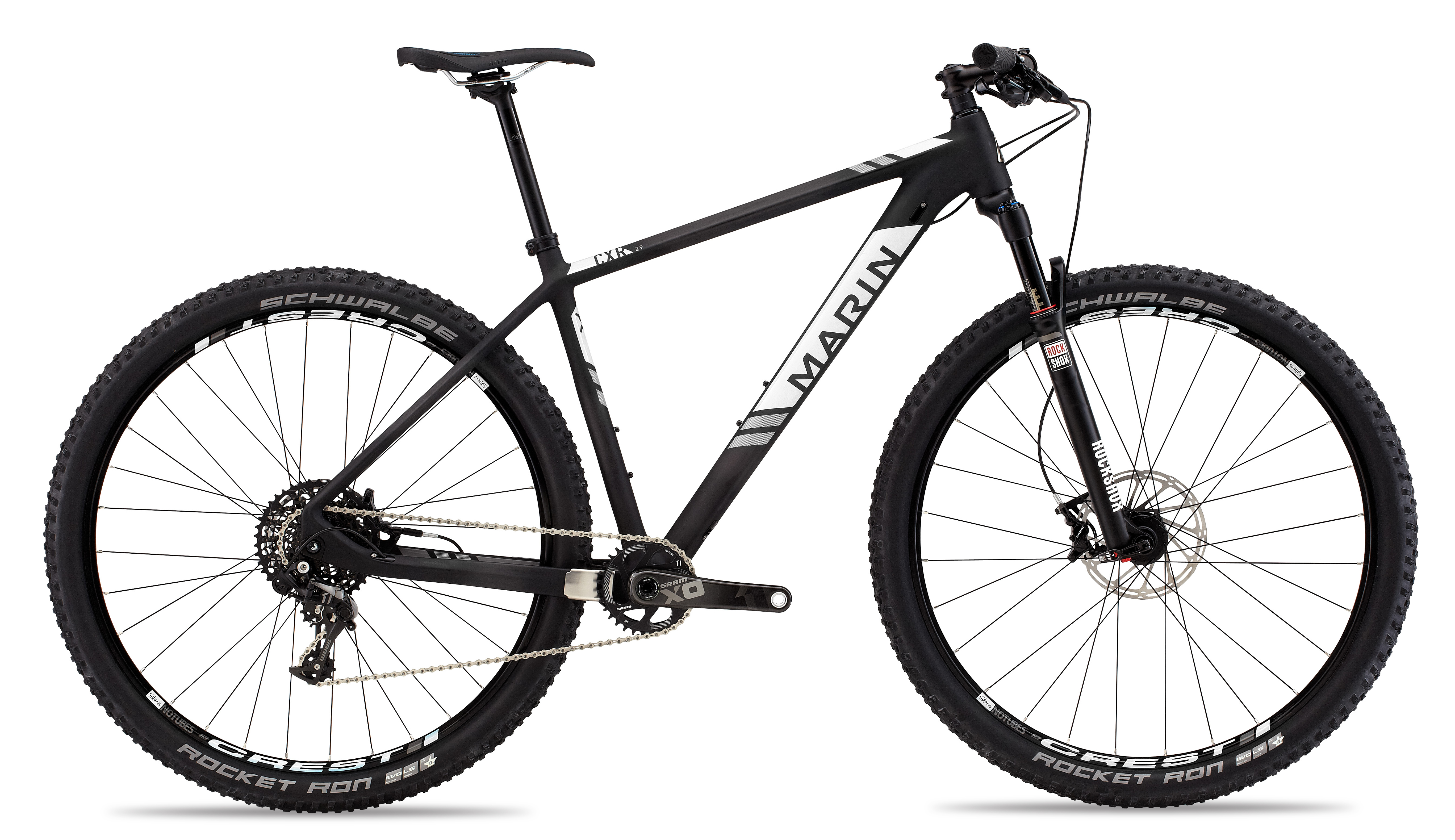
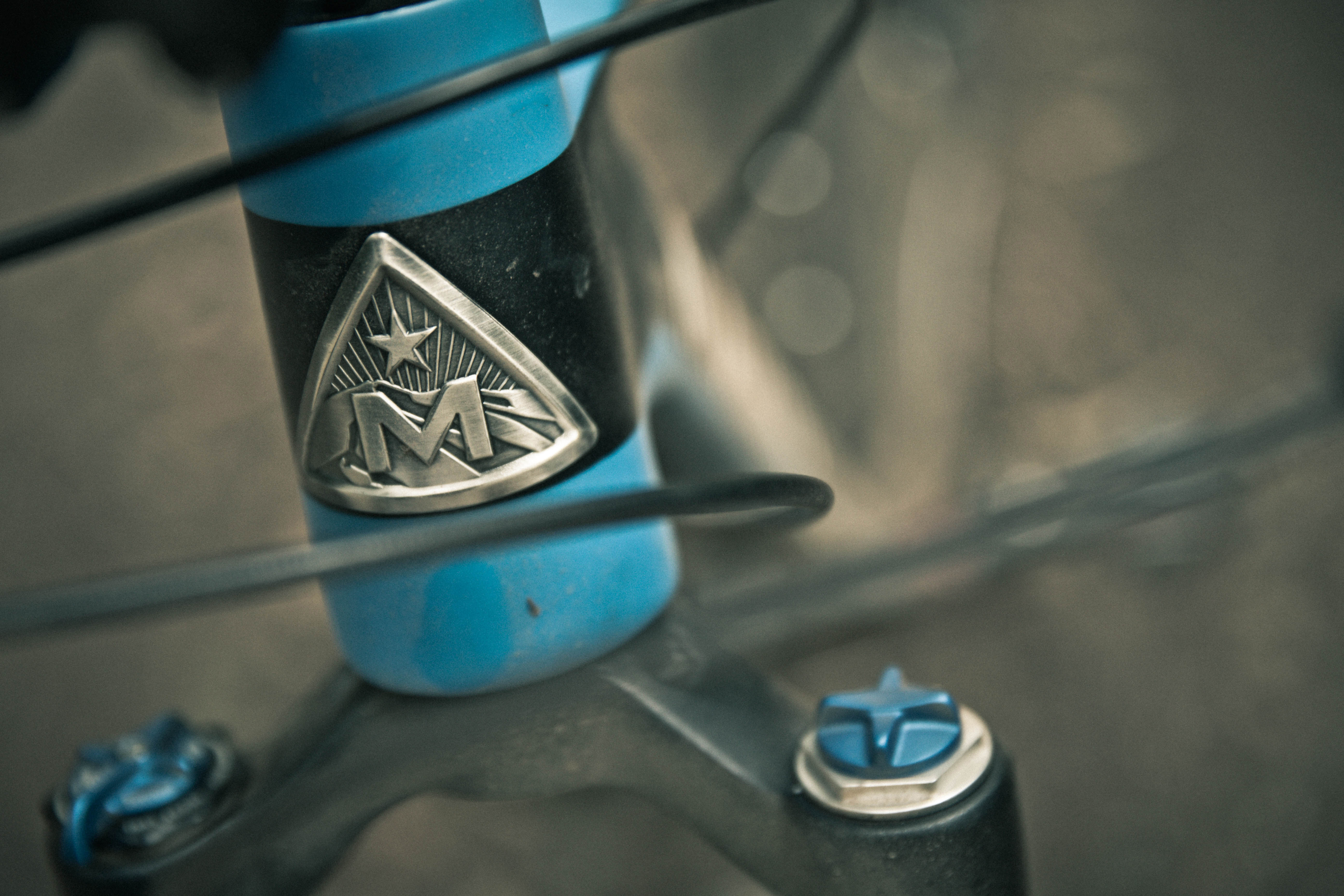
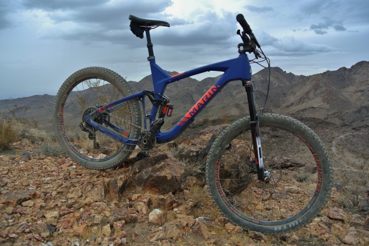
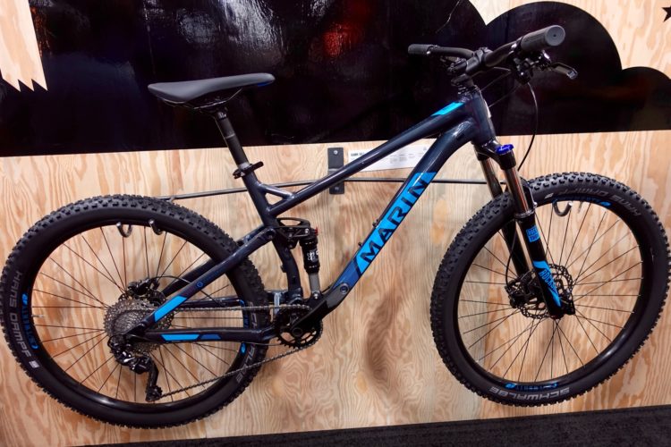
Marin Bikes
Just north of Specialized in Marin County, California, Marin Bikes went through a re-branding a few years ago. In 2013, when founder Bob Buckley retired, the company found its image had grown somewhat stagnant.
With a new direction and a new creative team on board, the logos, branding, and marketing got an upgrade.
“You know, in a lot of ways, we’re a 32-year-old startup,” said Marin’s brand director Chris Holmes. “I think what happened, it happens often, where you have a brand that’s founded by someone who’s super passionate, he or she pours all their energy into it and after a while, it’s like, okay, I’m ready to go do something else.”
On top of refreshing their logos and branding, Marin cancelled their carbon road bike line, and took a stance on the type of people they wanted at Marin, both athletes and staff.
“No assholes,” says Holmes. Their vision for the brand is to reflect its location, the laid-back California vibes, and to be an approachable and friendly company.
Even the enduro and freeride athletes, along with the company’s ambassadors, are carefully selected to align with this philosophy.
“I’m sure you’ve met other athletes that are like, okay, whatever, I’ll say hi to you, but then I have to go,” he said. “We’d rather have someone who might come in fifth or sixth place in a race, but someone who is an awesome person that you’d want to have a beer with.”
In the end, the athletes, just like the company’s marketing all play a role into which bike a consumer might purchase.

“When it comes down to it, these are emotional purchases. Sure, you can rationalize it, [and say], I’m going to do this because I’m going to ride to work, and save money on gas, or get in shape,” says Holmes.
“But, in reality, these are essentially toys — escape vehicles for us. When you’re going out and spending a lot of money on a bike, you want to be really proud of it and be able to show it off, and show your friends you have a cool bike,” he says. “If branding didn’t matter, the most popular bikes in the world would be just cheap bikes that people were sourcing from Alibaba or something.”

1 Comments
Aug 14, 2018
On top of refreshing their logos and branding, Marin cancelled their carbon road bike line, and took a stance on the type of people they wanted at Marin, both athletes and staff.
“No assholes,” says Holmes. Their vision for the brand is to reflect its location, the laid-back California vibes, and to be an approachable and friendly company.
Hmmmm.